“Stop posting signs people won’t read and start posting (pretty) signs that matter.” (Rogers, 2012)
Apparently people don’t read signs (Rogers, 2012). So, why do libraries rely on them so much? Signs provide information and libraries are in the business of information…coincidence? I don’t think so. Libraries have a lot of information to share, and good signage can reduce the redundancy of frequently asked questions and difficulties in order to improve the usefulness, usability and desirability of the library and its offerings.
I chose to redo library signs that I noticed were not working during my observations for the context analysis assignment. If it doesn’t work, then it’s time to rethink solutions figure out what will. I used principles from Schmidt (2011), Williams (2004), and Roberts (2012), to guide my re-designs of the following signs.
Entryway Sign
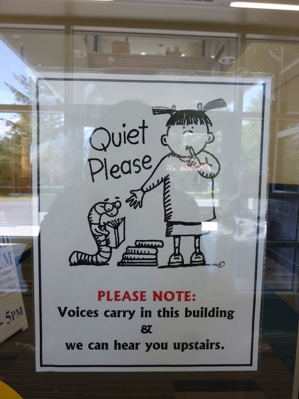
Original entryway poster (Sorry for the reflection…but it proves another challenge for putting up good signs!)
For the most part, people tend to be fairly quiet in the library, but the entryway ceiling opens to the second floor where the library is located. Unbeknownst to many, voices carry loud and clear. The informational sign posted doesn’t seem to catch people’s attention, as noted during an observation for the context inquiry assignment in which a young woman came in and continued her phone conversation even though she came through the door where the sign is posted. The image is cute, but it looks childish, so it might grab the attention of kids or parents, but others might ignore it. The attention grabbing text in red does not offer the most important piece of information and the centering takes away from the readability.
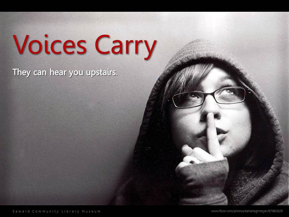
Entryway poster revolutionized
I looked for an image that was more generalizable to everyone, and came across this Creative Commons image on Flickr which appeals to me because it’s a dramatic black and white image and is off center. The young woman is attractive in a youthful way that many people can identify with, and she doesn’t look like she’s judging anyone. Plus, she’s looking up, as in upstairs. This image communicated the need for quiet, so I didn’t have to spell it out, thereby freeing up space to play with. I based my choice of words on what might actually be said to warn someone, as in “Psst, voices carry…they can hear you upstairs.”
Contrast: The image provided a great deal of the contrast. It was serendipity that the image didn’t quite fill the page, leaving a white band on the top and bottom, so I centered it and filled the background with black to give it further contrast and sophistication. I used large red text for the main message to grab people’s attention as suggested by Williams (2004). I chose the font based on readability at a distance, by zooming out to see if it can still be read. I added a shadow to the text to improve the readability by adding additional contrast since it was on top of the grey part of the image.
Repetition: The black band on top is repeated on the bottom. Though I played with a lot of fonts, this sign had so little text on it; I decided to use the same font for all the elements, just in different ways.
Alignment: I set most of the text on the left to accent the image, except for the attribution URL. I spread out the name of the library in the bottom band making it easier to read in a small font size, and wondered if it clashed too much with the plain text of the URL, but decided to keep it…I’m still not sure if I should have done that. The JPG image isn’t as clear as the PPT or PDF, so it stands out better in the actual document.
Proximity: The two lines of text are close together, so that when the eye is drawn to the red text, the person will easily follow through and read the white text. I placed the attribution URL for the image below the image in a small font size to the right because I wanted the eye to continue to drop to the library’s name after reading the main message.
Printer Sign

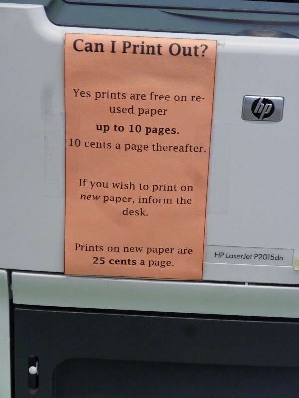
Original printer sign
This sign isn’t working either. It’s taped to the front and side of the printer, but people using the printer aren’t reading it. During my context analysis, I watched a young man collect his printed items in confusion, looking from back to front over and over. He checked with the front desk to figure out what happened, and stated that he was confused as he walked away…still looking perplexed. I imagine this must happen frequently.
Besides not catching people’s attention, the words, re-used paper, are split between two lines, and even I made the mistake of thinking re-cycled paper, which had a totally different meaning. It’s too text heavy and the centering makes it hard to read or make sense of at a glance.
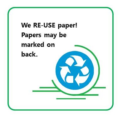
Mini printer sign revolutionized (or better yet, this one!)
My solution is two-part. First, I made a small sign to place on the printer, and then, using the same image to link the two, I made a poster to place next to the printer to grab people’s attention. I chose the image because it had the familiar recycle symbol on it and the extra lines around it gave it the feeling of motion, which I thought was a good association for a printer. I decided not to use either of the two logos for the library since they clashed with the overall design, didn’t look good if made very small, but I thought it was important for the name of the library to be included to give it some formality and gave it a wide spacing so it stands out and is easy to read as I did in the last poster.
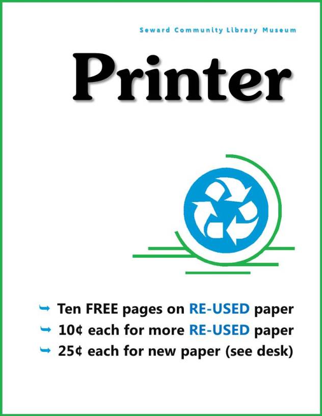
Printer poster revolutionized (or better yet, this one!)
Contrast: The large title in bold stands out as the focus point in contrast to the bright blue and green recycle image. I took a bit of a chance using a slab serif for the title, but it was the large contrasting focus piece, so I thought I could get away with it here.
Repetition: I used the same font for all but the large title. The bright blue color is repeated throughout the design. The arrows in the recycle logo are repeated in the bullet points in the same color. I also used the same fonts for the Entryway poster, including the name of the library, which was set with wide spacing to help it stand out.
Alignment: The different sizes, contrasts and colors of the elements provided plenty of variety, so I used a right side alignment throughout for a distinct, simple and readable design. I also made an effort not to space all the elements out evenly.
Proximity: The name of the library was placed above the title, to emphasize whose printer and sign these belong to. This prevents having to repeat this information to clarify who to see in the last bullet point. The details about the paper used and cost is together in one block element.
I kept fiddling with the designs, trying this and that, getting a little lost in all the details. It was particularly helpful to walk away from it for a bit and look at it again later, but sometimes, it just has to be good enough. The best part is that all this experience adds up and I can get better at this. *edit In fact, I was struck by an idea while double checking the layout for this post and came up with a mini sign (JPG) and a large sign (PDF), that looks better.
Sometimes a library is limited by its resources, and I was hoping that I could use software that was fairly common to make a decent sign. I chose PowerPoint, and was pretty pleased with how it worked, although I need to purchase more fonts. It’s probably a good idea to embed the fonts in the saved document, though, so others can view and edit in case they don’t have that font. The most challenging aspect was the alignment, since a text box alignment was not equal to the actual text. Sometimes a local printer won’t do a design justice, so it may be worth the effort of taking it to a copier for a more professional print if it will be around for a while.
Roberts, J. (2012). Signs that work, part 2. Event and informational signage. Retrieved from http://jrdesignstrategies.com/environmental-design/1459/
Schmidt, A. (2011). Signs of good design: The user experience. Retrieved from http://lj.libraryjournal.com/2011/02/opinion/aaron-schmidt/signs-of-good-design-the-user-experience/
Williams, R. (2004). The non-designer’s design book: Design and typographic principles for the visual novice. Berkeley, CA: Peachpit Press.
Also, for inspiration, check out this blog: Library Graphic Design


trishalendo 8:34 am on August 7, 2013 Permalink |
Love the picture and love the idea. Getting a larger group of bloggers to collaborate would really help create more frequent blog posts.
pmartin 5:33 am on August 8, 2013 Permalink |
Thanks for introducing me to Microsoft Lync, Valarie! ‘Had never heard of it before this post!
daniellek9888 11:58 am on August 11, 2013 Permalink |
What a great letter you wrote. I think blogging is such a great idea. Even though it may be difficult to think that teenagers could possibly blog without doing inappropriate language but it could really make a difference and create a whole different environment.